SB

Time It

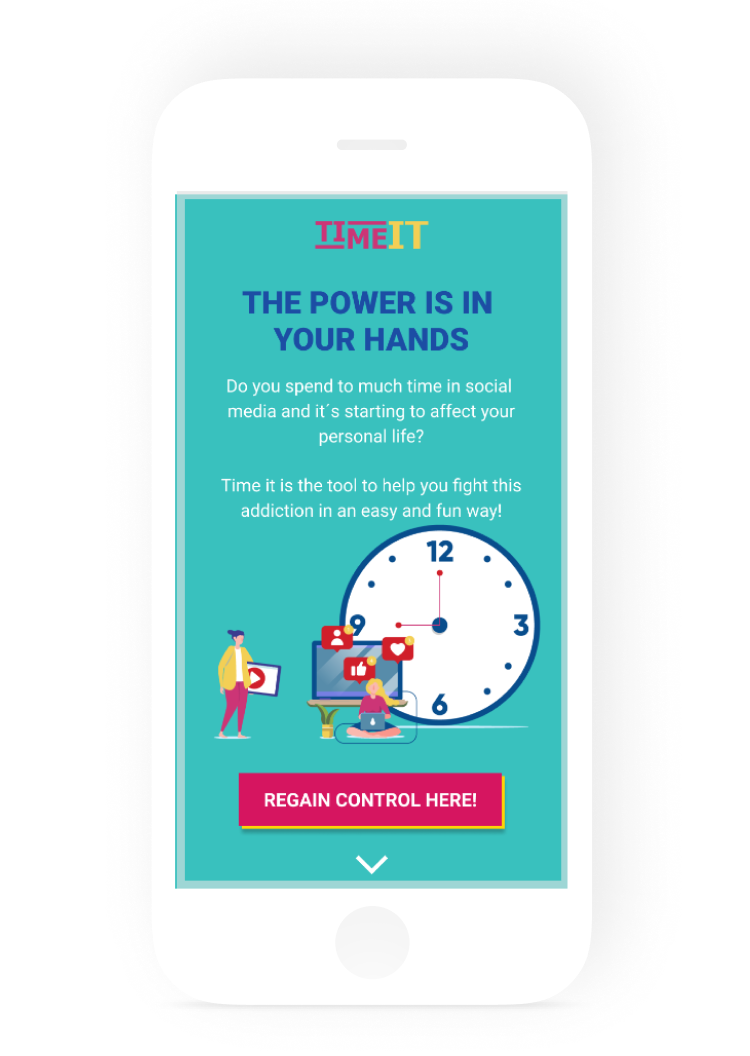
A landing page for an app to manage time in social media.

image of app
ROLE

- UX / UI Design


DURATION

- 3 Weeks


TOOLS

- Figma

- Photoshop

desktop showing the website

The Challenge

Create a landing page for a fictional product, to help people who are addicted to social media disconnect from their phones.

empty theater with one person
01

Content First

1.1 Elevator Pitch

"Time it" is a time management app, that helps you control the time you spend on social media, so you can regain your life back.

1.2 Audience

This app is for the Y generation who are currently addicted to social media, but, they know they spend to much time on Facebook, Instagram, etc.. and they want to regain power.
protopersonas
1.3 Content

Before I started with the design, I defined the content that will appear on the landing page.
02

Build

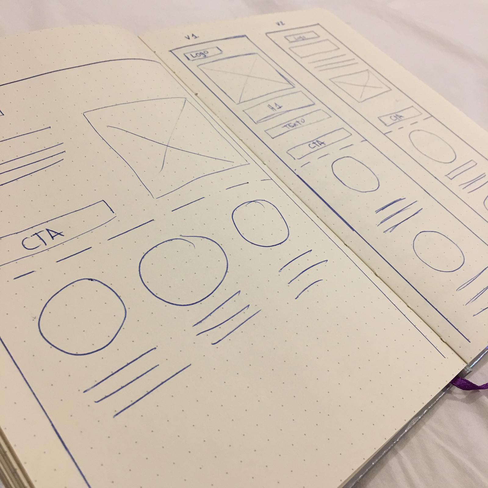
2.1 Lo-Fi Wireframes

The First step of bulding the landing page, was to draw Low-Fi Wireframes.

protopersonas
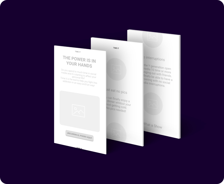
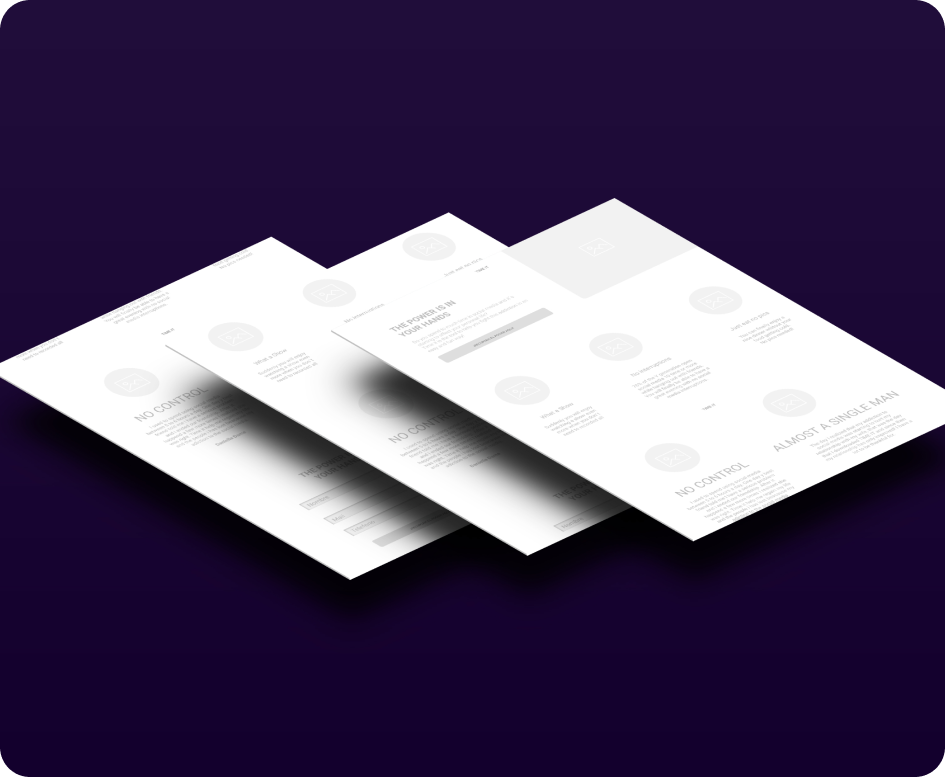
2.2 Hi-Fi Wireframes
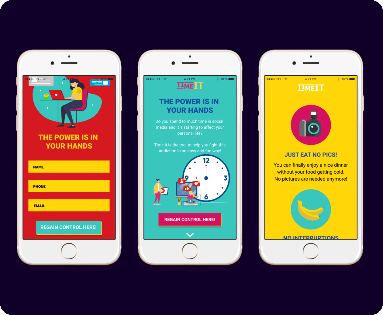
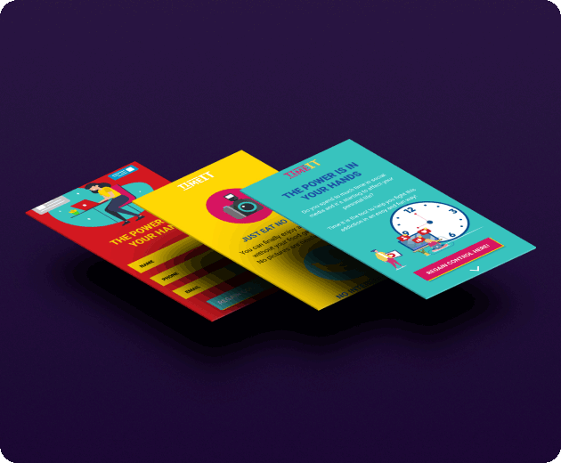
Mobile protopersonas
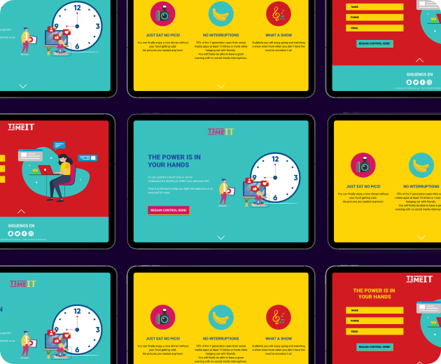
Desktop protopersonas
1.3 Content

Before I started with the design, I defined the content that will appear on the landing page.
protopersonas
03

Visual

3.1 Styleguide

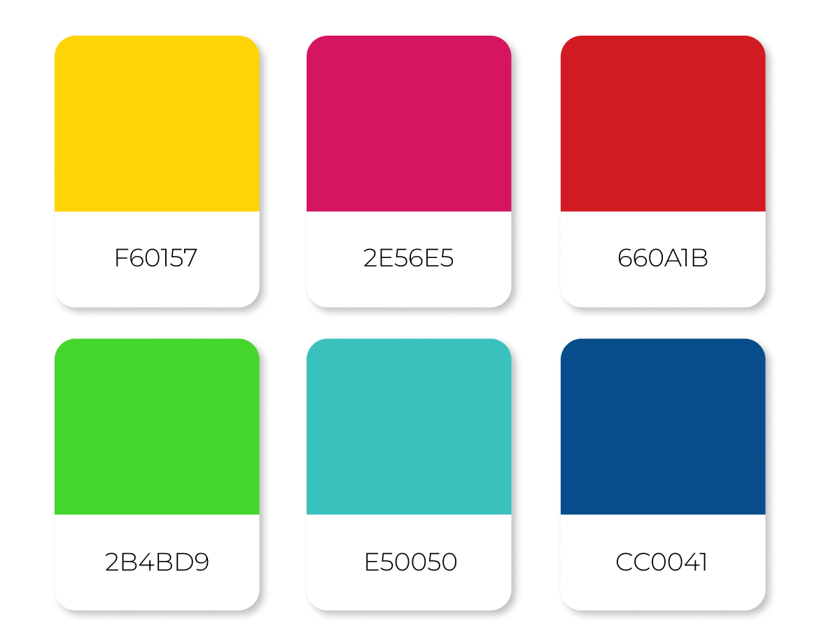
Color Palette


Color palette of the web

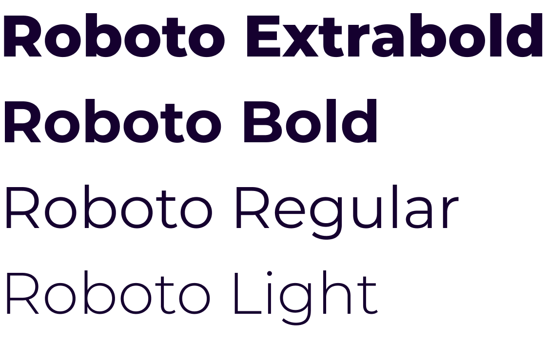
Typography


Typography

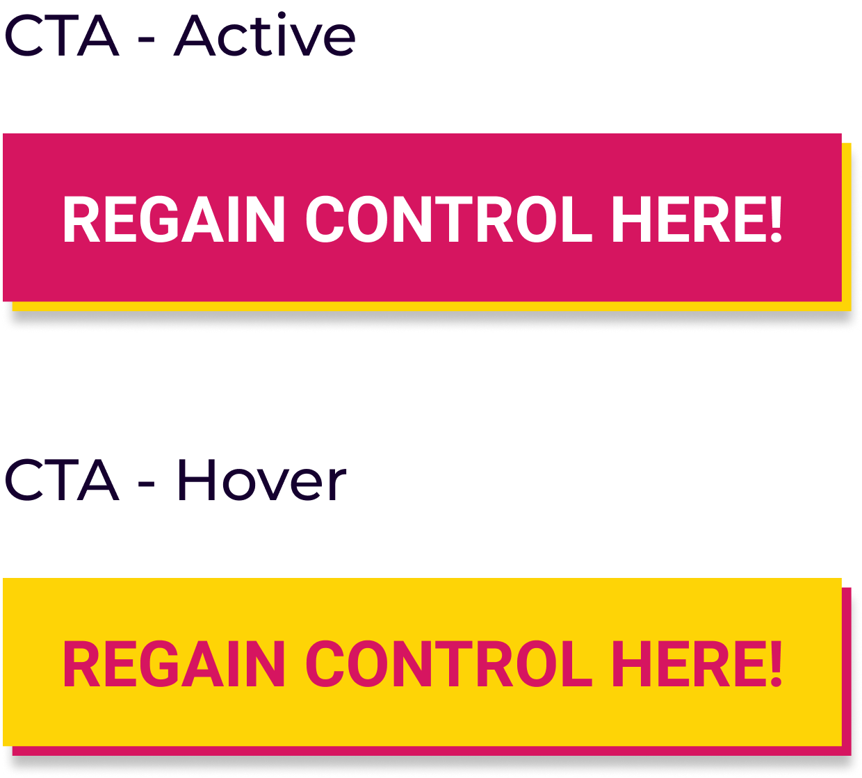
Icons & CTA


Icons and main cta

UI Design


gif of ui of the web